Modern Techniques in Frontend Design
— به انگلیسی منتشر شده
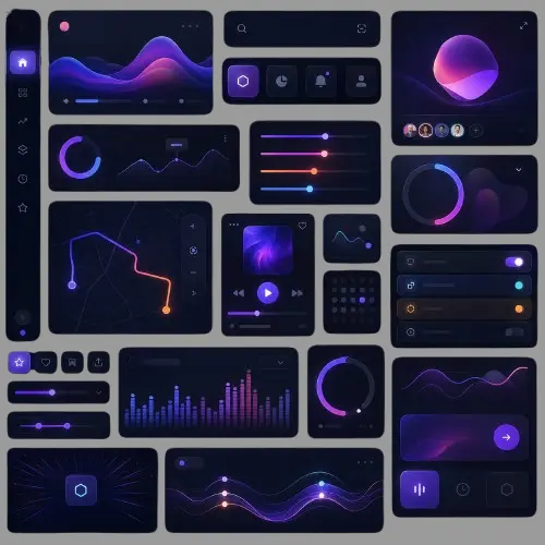
Frontend design has evolved far beyond static layouts and flat colors. Explore the techniques that define today's most compelling digital interfaces — from fluid motion systems and spatial depth to design tokens and accessibility-first thinking.
Why Frontend Design Is No Longer Just Styling
The role of frontend design has expanded dramatically. What once meant choosing fonts and arranging buttons now encompasses motion choreography, adaptive layout systems, perceptual color theory, and component-level architecture. Modern frontend designers are expected to think in systems, not just screens.
Users have grown more sophisticated. They interact with dozens of polished digital products every day, and their expectations have risen accordingly. An interface that simply functions is no longer enough — it must feel responsive, coherent, and intentional at every breakpoint, interaction, and state.
اگر این بخش را دوست داشتیدDesign Without Words Is DecorationThis shift has produced a new generation of techniques that blur the line between engineering and visual craft. Understanding these approaches is essential for any designer or developer who wants to build interfaces that stand apart in an increasingly crowded digital landscape.
- Design systems that scale across products and teams
- Motion and animation as communication tools
- Spatial depth through layering and elevation
- Fluid and adaptive typography
- Accessibility woven into visual decisions
- Design tokens as the bridge between design and code
Design Tokens: The Foundation of Scalable Interfaces
Design tokens are the atomic building blocks of any modern design system. Rather than hardcoding values like colors, spacing, and typography throughout a codebase, tokens give those values a name and a purpose — making it possible to update an entire interface by changing a single variable.
اگر این بخش را دوست داشتیدContent Clusters for GEO: How to Build Topical Authority That AI Engines TrustA color is not just #1A73E8. It is 'color.action.primary'. That distinction matters enormously. When a brand refreshes its palette, a token-based system means one change propagates everywhere. Without tokens, the same change requires combing through hundreds of files.
Tokens also enable theming. Light and dark modes, high-contrast accessibility modes, and even white-labeled products for different clients become manageable when every visual decision references a token rather than a raw value. Tools like Style Dictionary and Theo have made it practical to share token definitions between design tools and production code.
The most mature implementations separate tokens into tiers: primitive tokens that define the raw palette, semantic tokens that assign meaning (such as 'background.surface' or 'text.secondary'), and component tokens that apply semantic values to specific UI elements. This layered approach gives teams both flexibility and consistency.
- Primitive tokens: raw values like hex codes and pixel sizes
- Semantic tokens: purpose-driven names that carry meaning
- Component tokens: element-specific applications
- Enables theming, white-labeling, and dark mode at scale
- Keeps design and engineering in sync automatically
Motion Design: Animation as a Language
Motion in interfaces is not decoration. When used with intention, animation communicates state changes, establishes spatial relationships, and guides attention without requiring a single word of instruction. The challenge is learning to treat motion as a design element with its own grammar.
Timing and easing are the two most powerful variables in any animation. A linear transition feels mechanical. An ease-out curve feels natural, as if the element is decelerating into place like a physical object. These differences are subtle but perceptible — they determine whether an interface feels alive or robotic.
Modern teams document motion in the same way they document color or typography — as part of a design system. A motion scale might define micro (under 100ms for hover states), short (100–200ms for element reveals), medium (200–400ms for page transitions), and long (400ms and above for cinematic moments). Applying these consistently creates an interface that moves with a recognizable personality.
Libraries like Framer Motion for React and the native Web Animations API have made sophisticated animation more accessible than ever. But tooling is secondary to intention. The first question is always: what does this animation communicate? If the answer is nothing, the animation should be removed.
- Use easing curves that mimic physical motion
- Define a motion scale as part of your design system
- Animate state changes to help users track context
- Use staggered reveals to create hierarchy and rhythm
- Always ask what the animation communicates before adding it
- Respect prefers-reduced-motion for accessibility
Fluid Typography and Responsive Type Scales
Typography is the most direct communication tool a designer has. Modern frontend design has moved well beyond fixed font sizes toward fluid type systems that respond intelligently to viewport size, reading context, and content hierarchy.
The CSS clamp() function transformed responsive typography. Instead of defining separate font sizes for each breakpoint, designers can now specify a minimum size, a preferred fluid value, and a maximum size in a single declaration. The result is type that scales smoothly across every screen without abrupt jumps.
Modular type scales — built on ratios like the Major Third (1.25) or Perfect Fourth (1.333) — give interfaces a mathematical harmony that readers feel even when they cannot identify it. Each heading size, body size, and caption size relates to the others proportionally, creating a visual rhythm that reinforces hierarchy.
Variable fonts have opened another dimension of typographic control. A single font file can contain an entire range of weights, widths, and optical sizes, allowing designers to fine-tune type for different contexts without loading multiple files. This benefits both design quality and performance.
- Use CSS clamp() for smooth viewport-responsive sizing
- Build type scales on mathematical ratios for visual harmony
- Leverage variable fonts for expressive, performant typography
- Define type tokens alongside color and spacing tokens
- Optimize line length (45–75 characters) for readability
- Use optical sizing for display versus body contexts
Spatial Design: Depth, Elevation, and Layering
Flat design simplified interfaces and cleared away the visual noise of skeuomorphism, but it also flattened hierarchy in ways that made complex interfaces harder to read. Modern frontend design has embraced spatial thinking — using elevation, shadow, blur, and layering to create depth that aids comprehension.
Elevation systems, popularized by Material Design, assign layers of depth to interface components. A modal sits above a sheet, which sits above the main content surface. Each layer has a corresponding shadow and background treatment that signals its position in the stack. Users understand these relationships intuitively because they mirror physical reality.
Glassmorphism — the technique of using frosted, semi-transparent backgrounds with subtle blur — has become a dominant expression of spatial depth in modern interfaces. When applied with restraint, it creates a sense of layered surfaces that feels both modern and grounded. The technique requires careful attention to contrast ratios to remain accessible.
Parallax scrolling and scroll-driven animations add another dimension of spatial storytelling. As users scroll, elements move at different rates, creating a sense of depth and narrative progression. CSS scroll-driven animations, now supported natively in modern browsers, make this technique far more performant than JavaScript-based alternatives.
- Define an elevation scale with consistent shadow values
- Use blur and transparency to communicate layered surfaces
- Apply scroll-driven animations for spatial storytelling
- Ensure depth cues maintain sufficient color contrast
- Reserve elevation for components that need to stand out
- Test spatial effects on real devices, not just design tools
Component-Driven Architecture and Design Systems
The component model has fundamentally changed how interfaces are designed and built. Rather than designing pages, modern teams design components — self-contained, reusable UI units that can be assembled into any layout. This shift enables scale, consistency, and collaboration in ways that page-based workflows cannot.
A mature design system includes components at multiple levels of abstraction. Atoms are the smallest units: buttons, inputs, icons, labels. Molecules combine atoms into functional groups: a search field with a button, a form label with an input. Organisms assemble molecules into complete interface sections: a navigation bar, a product card grid, a checkout form.
Storybook has become the standard tool for developing and documenting components in isolation. It allows designers and engineers to build every state of a component — loading, error, empty, populated, disabled — before integrating it into a real product. This practice surfaces edge cases early and ensures components behave correctly across all possible inputs.
The introduction of server components in React and similar patterns in other frameworks has blurred the traditional boundary between design and data. Frontend designers now need to think about component architecture not just visually but structurally — understanding how components fetch, cache, and render data as part of the design decision itself.
- Design components at atoms, molecules, and organisms levels
- Document every state and variant in a component library
- Use Storybook or equivalent for isolated component development
- Treat component APIs as design decisions, not just engineering details
- Maintain a single source of truth for components across design and code
- Version your design system like a software product
Accessibility as a Design Technique, Not an Afterthought
Accessibility is not a compliance checklist. When treated as a design principle from the beginning, it produces interfaces that are clearer, more usable, and more resilient for every user — not just those with disabilities. Modern frontend design teams integrate accessibility into their visual language, not their QA process.
Color contrast is the most visible accessibility consideration, and it has aesthetic implications beyond compliance. Designing with sufficient contrast — at minimum 4.5:1 for body text — forces designers to make color choices that are actually legible rather than merely decorative. Many beautiful, high-contrast interfaces outperform their low-contrast counterparts aesthetically as well as functionally.
Focus states are another area where accessibility and design quality intersect. For years, browsers defaulted to an outline that many designers suppressed because it felt visually jarring. Modern practice designs custom focus indicators that are both visible and beautiful — using offset outlines, color, or combined techniques that enhance the overall visual system rather than disrupting it.
Motion accessibility requires particular attention. The prefers-reduced-motion media query allows designers to provide an alternative experience for users who are sensitive to animation. Respecting this preference is not just considerate — it forces teams to ensure that animation enhances rather than constitutes the experience, since the interface must work without it.
- Design color systems that meet WCAG contrast standards
- Create custom focus states that complement the visual system
- Use semantic HTML as the foundation for all components
- Test interfaces with keyboard navigation and screen readers
- Implement prefers-reduced-motion for all animations
- Treat accessible design as a quality signal, not a constraint
Performance as a Design Value
A beautifully designed interface that loads slowly or responds sluggishly is a failed design. Performance is a user experience dimension, and modern frontend designers share responsibility for it alongside engineers. The choices made in design — image formats, font loading strategies, animation techniques, layout complexity — all have direct performance consequences.
Core Web Vitals have given the industry a shared vocabulary for performance. Largest Contentful Paint measures loading, Interaction to Next Paint measures responsiveness, and Cumulative Layout Shift measures visual stability. Each metric maps directly to a user experience quality that designers control. A layout that shifts as images load is not just a performance failure — it is a design failure.
Modern image formats like WebP and AVIF, combined with responsive image techniques using the srcset and sizes attributes, allow designers to use rich imagery without paying the performance cost of large files. Variable fonts, as mentioned earlier, reduce font loading overhead significantly. CSS-native animations outperform JavaScript animations on the main thread.
Skeleton screens and optimistic UI patterns are design techniques specifically developed to address the perception of performance. A skeleton screen fills the space a component will occupy, giving users a sense of progress and reducing perceived wait time. Optimistic UI updates the interface immediately when a user takes an action, assuming success and correcting only if an error occurs. Both techniques make interfaces feel faster without changing a single byte of network payload.
- Use modern image formats (WebP, AVIF) with responsive srcset
- Prefer CSS animations over JavaScript for performance
- Design skeleton screens that match real content dimensions
- Use optimistic UI to make interactions feel instantaneous
- Reserve layout space for images to eliminate Cumulative Layout Shift
- Treat Core Web Vitals as design metrics, not just engineering metrics
Dark Mode and Adaptive Color Systems
Dark mode is no longer an optional feature. Users expect interfaces to respect their system preferences, and designing a high-quality dark mode requires a fundamentally different approach to color than simply inverting a light palette.
Effective dark mode design starts with elevation-based color. Rather than using a single dark background, surfaces at different elevations receive progressively lighter shades of the background color. This replicates how light behaves physically — surfaces closer to a light source appear brighter — and helps users perceive depth and hierarchy in low-light conditions.
Saturated colors that work well on white backgrounds often become overwhelming or illegible on dark surfaces. A brand color that is vibrant and readable at full saturation on light may need to be desaturated or lightened for dark mode use. Designing adaptive palettes — where each semantic color token has both a light and dark value — is the systematic solution to this challenge.
The prefers-color-scheme media query and the CSS color-scheme property give designers the tools to implement automatic theme switching without JavaScript. Combining these with CSS custom properties means a complete theme change requires updating only the root token values — an elegant demonstration of why the token architecture described earlier is so powerful.
- Design elevation-based background colors for dark mode surfaces
- Create separate dark mode values for all semantic color tokens
- Desaturate or lighten vivid colors for dark mode legibility
- Implement theme switching with CSS custom properties
- Test dark mode designs in actual low-light conditions
- Avoid pure black backgrounds — use very dark grays instead
The Future: AI-Assisted Design and the Human Edge
Artificial intelligence is reshaping the frontend design toolkit. From auto-layout systems that generate responsive code from visual designs to AI tools that suggest accessibility improvements and performance optimizations, the production speed of modern design has increased dramatically. But speed is not judgment.
AI tools are exceptionally good at pattern matching and execution. They struggle with the most important design questions: who is this for, what should they feel, and what makes this particular interface worth remembering? Those questions require human insight, cultural awareness, and aesthetic conviction that no model currently possesses.
The designers who will define the next era of frontend design are those who use AI to accelerate the craft while deepening their strategic and perceptual abilities. They will be faster at production work, leaving more time for the thinking that machines cannot do. The competitive advantage will belong not to those who use AI most, but to those who think most clearly about what they are building and why.
- Use AI tools to accelerate production, not to replace thinking
- Invest in perceptual skills that AI cannot replicate
- Treat AI-generated outputs as starting points, not final answers
- Stay curious about emerging CSS and browser capabilities
- Build taste through exposure to great design across all media
- Remember that the goal is always communication, not novelty
Conclusion
Modern frontend design is a discipline of systems, intentions, and craft. The techniques covered here — design tokens, motion systems, fluid typography, spatial depth, component architecture, accessibility, performance, adaptive color, and AI assistance — are not independent trends but interconnected layers of a coherent practice.
Each technique exists in service of the same goal: creating interfaces that communicate clearly, behave reliably, and feel worthy of the time users spend with them. The most technically sophisticated implementation is still a failure if it does not serve that purpose.
Frontend design has never been more powerful, more complex, or more consequential. The interfaces built today will shape how billions of people interact with information, products, and each other. That responsibility deserves more than trend-following — it deserves deep, deliberate craft.